Creating an effective flyer is essential to any marketing campaign. These days, you can use a free flyer maker like Vista Create which offers tons of templates and ideas. Nevertheless, knowing how different colors evoke certain feelings and reactions in viewers can help you curate a flyer that elicits the desired response.
With color psychology as your guide, you can use the appropriate combination of hues to increase interest in your message and ultimately measure its success. In this blog post, learn how understanding color theory and experimenting with design elements will make all the difference when designing flyers for maximum engagement.
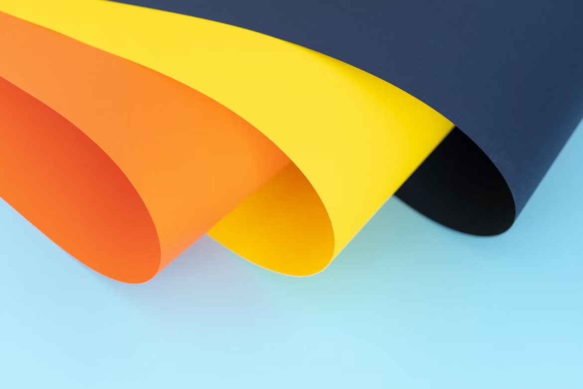
Table of Contents
Introducing Color Psychology and How It Affects Perception
Different colors evoke different emotions and can create specific moods that ultimately affect the decision-making process of your audience. For example, red is often associated with urgency, while blue is seen as calming and trustworthy. Combining colors can also create a unique vibe for your flyers.
Which Colors Should You Use to Create Maximum Impact on Your Flyer Design?
To create a high-impact flyer design, you should consider using bright colors like red, orange, and yellow. These are known to be attention-grabbing and can create a sense of urgency.
On the other hand, if you want to create a more subtle and elegant design, you can consider using shades of blue, green, or purple. These have a calming effect and are perfect for creating a more relaxing atmosphere. Whatever you choose for your flyer design, make sure they are consistent with your brand and the message you want to convey.
Tips for Combining Color Schemes for a Dynamic Visual Impact
Colors are an important aspect of design, and combining them can sometimes be an overwhelming task. But fear not, as there are tips and tricks to help you achieve a dynamic visual impact.
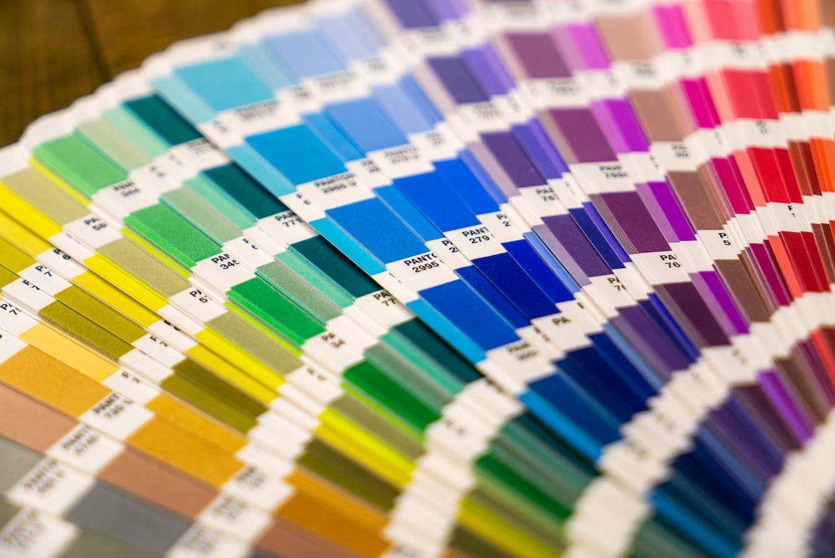
One way to do this is by choosing complementary colors, which are opposite each other on the color wheel. Another option is to use analogous colors, which are next to each other on the wheel, to create a harmonious look.
You can also try using triadic colors, which consist of three colors spaced evenly on the wheel. In combinations, balance is key – use a neutral color as a base to offset bright or bold colors.
Crafting an Eye-Catching Header with Color Psychology
An eye-catching header is essential for any successful marketing campaign. Not only does it attract attention, but it also conveys important information about your product or service.
However, did you know that the colors you use in your header can have a significant impact on how it is perceived? Color psychology plays a crucial role in branding, and understanding the emotions different colors evoke can help you craft a header that resonates with your audience.
For example, blue is often associated with trust and reliability, while red is used for urgency and excitement. By utilizing the power of color psychology, you can create a header that not only stands out but also communicates the right message to your target audience.
Utilizing Contrast and Colors in Your Call-to-Action Text
When it comes to creating a call-to-action (CTA), the color and contrast of your text are crucial factors to consider. You want your CTA to stand out, grabbing the viewer’s attention and encouraging them to take action.
Using contrasting colors can help make your CTA pop and draw attention to it. Additionally, selecting colors that align with your branding can further emphasize the importance of your CTA. By intentionally utilizing contrast and colors in your CTA text, you can effectively communicate the value of your offer and nudge potential customers toward a conversion.
Bottom Line
Color is an incredibly powerful tool in flyer design, as it can be used to enhance the impact of text and graphics. From implementing a monochromatic scheme to choosing colors that create contrast, understanding how to use color psychology in your flyer design will help you effectively communicate your message and draw attention to your call to action.
Creating a strong visual hierarchy with different colors is key to ensuring the main elements on your flyer stand out from the rest. While the importance of color psychology can be overlooked when beginning the design process for your flyers, it should not be underestimated. Taking the time to carefully select colors for your flyer design can make a significant difference in its effectiveness.