A business card is often one of the first impressions that people see of your business. When you hand over your card, they make many instant judgements, deciding whether your business seems legitimate and professional, and whether they can trust you with their accounts. That’s why the design and quality are so important, and with many easy to use templates online, it should be fairly straightforward to create your own business card. However, if you don’t have a natural flair for design, there are certain mistakes that can be made, and here are some common things that can turn a card from professional to amateur looking.
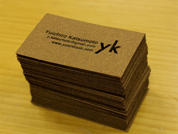
Image crdit: yuichirock
Table of Contents
Ambiguous logos
Business cards don’t have a huge amount of space, and therefore putting a small, scaled down company logo simply might not be the best design choice. You may not be able to read the company name, or tell what the graphics are representing when the logo is shrunk, so consider leaving it out in favour of a nicely printed company name.
Mixing fonts
Using more than one type of font can look a complete mess if you’re not well versed in design rules. Pick one type of font for the heading and body, simply changing the size and colour for a sleek, professional look.
Too many colours
Perhaps worse than mixing fonts, is mixing too many colours, so simplify and stick to simple looks that don’t clash. Ideally, you’ll want the colours used in your font and design to provide a contrast against the background, so don’t be tempted to use colours that are too close together.
Too much information
A business card is a way of passing over your information, not giving your life story. It’s not a CV or a website, so keep the details basic. A good business card should include:
- Your name
- Job title
- Company name
- Telephone numbers
- Website or social media addresses
- Slogan or mission statement
Anything beyond this simple information is going to simply clutter up your card, making it difficult to read which can mean it goes ignored. Make your life easier by simply using your business card as a gateway to the information, with recipients able to visit your site or call for more information.
Not enough whitespace
While whitespace can be a cardinal sin when designing a website, it’s important to give your text and graphics some room to breathe on a small space such as a business card. When you design business cards on brunelone.com and similar websites, you should aim to leave just enough space so that the eye can take it all in, so don’t cram extras in that aren’t on the template.
Adding hyperlinks to paper
Adding the URL of your website or social media page is a great idea, but these don’t need to be long, hyperlink style texts. Don’t print them underlined and in blue, and consider using a simplified version of the URL by removing unnecessary http or www prefixes.
Remember that:
- Most social networks have shortened URLs available to fit on cards
- You don’t need to add the social network logo
- Only use sites that are live and regularly updated
Non-standard sizes
Although standing out from the crowd is good in business, having an oddly shaped business card is bound to be annoying. Stick to a standard size that fits into wallets, on thick, quality paper that’s going to last so that they can be passed around and kept for the long term.
Tiny text
Although business cards are small, it’s not a good idea to use text under 12 points. If you’re having trouble fitting in the information you want, then consider cutting down on the amount of text or using both sides of the card, rather than making the text small, blurry, and unreadable.
Small text can also make the quality of the cards look less than perfect, with words seeming to blur into each other, and lacking that crisp professional finish that business people seek.
Poor quality
There are many companies out there who offer cheap business cards, with many deals that are hard to believe, and if you’re building a business then it’s tempting to go for the cheapest price out there. However, the saying that you get what you pay for is true, and a poor quality business card will reflect badly on you. Once you’ve got the design perfected, then consider paying a little extra for quality card and extras such as embossing for a classic finish.
Sharp printing
Once you’ve got the balance between colour, fonts, and whitespace perfect, then it’s important that this translates properly onto the business cards. By using a professional firm to make your cards, you’re ensured a professional finish, and therefore it’ll come out so much better than a DIY job or a cheap deal from an internet only firm. Print quality is incredibly important, making the difference between an amateur and professional business card.
Not getting samples
A business card looks very different on the screen than on card, and so getting a sample is essential before signing off on things. A reputable firm will be happy to send you some samples for your consideration, allowing you to make changes and get feedback amongst your staff before you decide what to do.
Your business card is often the way into a client’s radar, whether you give them out at a business networking event or slip them into a letter. That’s why it’s so essential that they’re done right, professionally finished, and looking great. Whether you’re a small business owner or looking to expand your professional network, a business card can open up new opportunities, and ensures the right people have your contact details. With the right design, you can showcase your brand in its best possible light, and can be sure that you get people to visit your social media or website, as well as getting in touch to find out what you can do for them.